August 10, 2009 7:10 PM
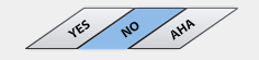
Ah, the joys of working with Flex 4. I built this small component in
Flex 4 that has slanted or hatched buttons. Each button is a
parallelogram and two sides along with the label are at an angle of 35
degrees. They look pretty good when coupled with a viewstack right
under it.
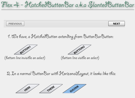
Once I built the Button extending from ButtonBarButton, it did not work according to what I had in mind with the default ButtonBar layout (horizontal). There was space left between the components (rightly so) which I did not want empty. I edited the skin to set a gap to -41 and it looked ok. But hard coding -41 is not nice. So I wrote a custom layout (HatchedLayout) that computes the correct distance (only if layoutElement is a HatchedButton). The whole thing took me a Friday afternoon.
This is how a HatchedButtonBar looks like:
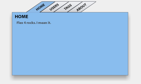
This is how the HatchedButtonBar looks like coupled with a ViewStack: View Demo
There's a demo app that shows the component by itself, with the normal layout and with the modified layout: View Demo
Let me know if you guys like it. As always, this is open source (under the MPL 1.1) and the source is available here for download.