December 9, 2009 11:29 PM
I came across this great post by Theresa Neil: 30 essential controls
for RIA design. I liked control twenty-three in particular: Scoped
Search. So I cooked up a Flex 4 navigation bar (vimeo style) that has
scoped search and is completely data-driven and customizable via CSS.
It does not use any images; everything is drawn. Along the way, I
built some potentially re-usable things like a dotted line
graphic element and a vertical separator layout.
Inspiration
Vimeo.com is beautifully designed. I noticed the beautiful top navigation header only when it was referenced from Theresa's article. The blended curves are beautiful. It is the "Scoped Search" part that drove me to build this component.
What is Scoped Search?
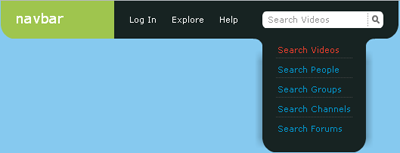
According to Theresa:
Scoped search like ITunes, allows for the optional selection
of a category before entering free form search text...
Demo
Click the image below to run the demo (view source enabled, the source is under MPL 1.1):
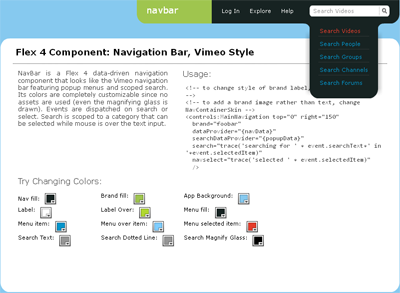
You can also download the FXP or look a the code at github.
The demo lets you change any color at runtime. These colors are passed in via CSS. In a real use-case, you could also change the data displayed at runtime.
On mouseover over a top level item, a popup menu is displayed. This menu stays open in the case of scoped search to allow changing the selected item in the list while displaying a changing prompt text if the user has not entered anything.
Events dispatched are shown in the bottom.
Using Navbar
To get started, declare the data to be set:
[Bindable]
private var navData:ArrayList = new ArrayList(
[{label: "Log In"}, {label: "Explore", menu: explorePopup},
{label: "Help", menu: popupData2}]);

private var explorePopup:ArrayList = new ArrayList(
    ["Categories", "Groups", "Channels",
     "Toys"]);

[Bindable]
private var searchCategories:ArrayList = new ArrayList(
    ["Search Videos", "Search People", "Search Channels",
     "Search Forums"]);
Assign them via the dataProvider and searchDataProvider attributes:
<!-- to change style of brand label, see scopednav.css -->
<!-- to add a brand image rather than text, change NavContainerSkin -->
<controls:MainNavigation top="0" right="150"
  brand="foobar"
  dataProvider="{navData}"
  searchDataProvider="{searchCategories}"
  search="trace('searching for ' + event.searchText+' in '+event.selectedItem)"
  navselect="trace('selected ' + event.selectedItem)"
  />
The search event is fired when a scoped search is performed (by clicking on the magnifying glass or pressing enter). navselect is fired when a menu item is clicked.
Components that come along with Navbar
1) There is a new GraphicElement, DottedLine, which you can use in Flex 4 the same way as Line, Rect, etc. DottedLine uses a bitmap fill to draw the dots (thanks to warm forest).
2) VerticalSeparatorLayout: If you notice the List in the popup menu, the separator (dotted line) is not drawn for the last element. This is done via a custom layout1 that makes the separator of the last item in the List invisible.
3) ScopedDropDown: This is used to popup the menu (List). It is a customized DropDownList which can stay open till it is notified that it can be closed.
4) Magnifying Glass: Not exactly a component, but an ellipse and a line that looks a lot like a search magnifying glass2.
Flex 4 Observations
Some points3 I noted while developing the component:
Rect
The Rect primitive can support setting a corner radius X, Y property on an individual corner via: bottomLeftRadiusX, bottomRightRadiusX, topLeftRadiusX, topLeftRadiusY, etc.
That said, for the blended look in the popup list, I had to cheat and draw two rectangles: one normal and another filled with background color and set with corner radius. Maybe there is a blend mode that can erase whatever is underneath it of a particular color?
CSS
In CSS, you use namespace|component. This is expanded to the fully qualified name of the component. This is important to know if you want to modify a style declaration at runtime (like in the demo). For example, if you wanted to change navFill defined in the CSS declaration container|NavContainer:
StyleManager.getStyleDeclaration('net.anirudh.container.NavContainer').
    setStyle('navFill', navfill.selectedColor);
The syntax in Flex 4 for CSS is incredibly powerful. For example, this is how the brand label is changed via CSS:
/* In NavContainer change Label with id brandLabel */
container|NavContainer s|Label#brandLabel
{
  fontSize: 18;
}
Skin
Any style defined for the component is available in the skin.
GraphicElement's don't support CSS, so you could bind properties
via getStyle() calls.
Override updateDisplayList() if you want to check a CSS property and
do something like make a Rect invisible in the skin.
GraphicElement
When you are building your own GraphicElement, you can access the Graphics object via:
//The base GraphicElement class has cleared the graphics for us.
(drawnDisplayObject as Sprite).graphics
Conclusion
Developing with Flex 4 is sweet, sweet bliss. In my opinion, this is the most well architected GUI framework out there.
[1] I'm certain this was never considered as a reason why people
would customize a layout. Nevertheless, it works beautifully with
minimal code.
[2] Yes, I know should have used an icon. But I wanted to be able to
change its color.
[3] Please do not consider any of these as hard and stead-fast rules.
These are simply my own observations.